The hamburger menu: where three lines came from, and how ours works
On a phone, most sites hide their menu behind three short lines. People call it the hamburger: a bun, a patty, a bun. It's older than the smartphone by about 25 years.
Where it came from
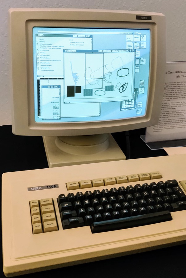
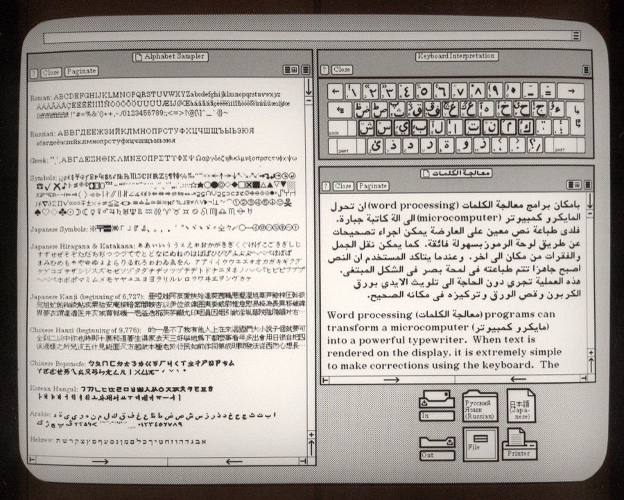
Norm Cox drew the icon for the Xerox Star, an office workstation introduced in 1981 and one of the first computers sold with windows, icons, and a mouse. In a 2014 interview, Cox called it a "container" for contextual menu choices, and said the team had about 16 by 16 pixels to draw it in. He also said they told users it was an air vent to keep the window cool.
How it reached phones
The icon mostly disappeared from desktop software after the 1980s. It came back from 2009, as apps for phones ran out of room for a row of menu links (Wikipedia's history). Responsive websites followed: one layout that rearranges itself for the screen, with the menu folded behind the icon on narrow screens.
The case for and against
For: it saves space. A phone screen is about 400 pixels wide, and a row of five or six links either wraps onto two lines or gets too small to tap.
Against: what people can't see, they use less. A 2016 usability study of 179 people on 6 sites found that on phones, sites with visible menus, or visible links plus a hamburger, did better than sites with only a hamburger. On one visible-menu site, 89% of people used the menu; on the hidden-menu sites, 44% and 56%. People also reached the menu sooner where some of it showed: 21 seconds on the fastest combined design, 33 seconds on the slowest hidden one.
Skunk Yard's menu has four links, so the case is close. We folded it, and we're measuring whether that helps.
How ours works
Under 600 pixels wide, the links fold behind a Menu button with the three lines beside the word. Wider screens show the links as before.
- A real button. It's a
<button>, so it works by keyboard and screen reader with no extra code.aria-expandedtells screen readers whether the menu is open, andaria-controlspoints at the links it shows. - Escape closes it and puts the focus back on the button.
- Works with JavaScript off. The menu folds only after its script
adds a
jsclass to the menu bar. Without the script, the button stays hidden and the links show. - No flash. The script sits inside the menu bar, so it runs before the page first paints.
- Same on every page. A test fails if any page's menu differs.
The CSS that folds it:
.menu-button { display: none; }
@media (max-width: 599px) {
  .nav.js .menu-button { display: flex; }
  .nav.js .nav-menu { display: none; flex-basis: 100%; flex-direction: column; }
  .nav.js.open .nav-menu { display: flex; }
}
The script adds the js class, and the button toggles open and
aria-expanded together. Lighthouse scored 100 in all four categories on phone
settings after the change.
What the tracking shows
Two analytics events, listed on the privacy page, count how
often people open the folded menu (menu_open) and click a menu link
(menu_click, with whether the menu was folded). The comparison that matters
is pages per visit on phones, before November 11, 2026 and after.
No results yet. This section gets the numbers once a few weeks of visits come in.
Image credits
Licenses checked on each image's own page on November 11, 2026.
- Xerox Star at Vintage Computer Faire West 2019, by leighklotz, August 3, 2019. License, quoted from the page: "Creative Commons Attribution 2.0 Generic". Resized to 603 by 900 pixels.
- Xerox Star 8010 ViewPoint, by Abdulla Al Muhairi, November 13, 2021. License, quoted from the page: "Creative Commons CC0 1.0 Universal Public Domain Dedication". Resized to 900 by 722 pixels.

